Fintech TV
1.0 Brand Introduction
Fintech TV connects buyers and sellers of financial technology. With Fintech TV we inform a dedicated global community of over 70,000 FinTech specialists, including key buyers of WealthTech, RegTech, payments and InsurTech solutions. For technology buyers, Fintech TV is an essential part of their research and discovery. For technology companies, Fintech TV helps extend the reach of their communication to key buyers in a targeted and intelligent way.
2.0 Fintech TV Logo
Our logo is our most valuable brand asset. It should remain consistent across our communication channels and never be modified. Use our logos with care and if you are unsure how, scroll through this page for examples and guidance for reference. If you need to download copies of the logo, visit our Download Portal.
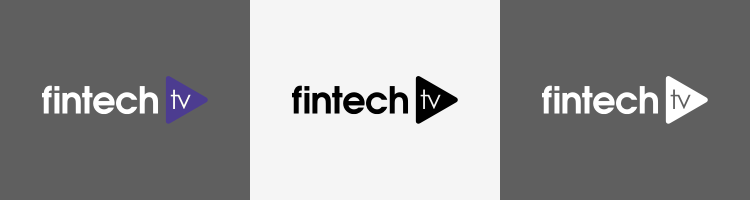
2.1 Main Logo
This is the master version of our logo and should be used in most circumstances.
![]()
2.2 Colour Variations
If the master version of the logo doesn’t work on your medium, we have colour combinations to satisfy need. Don’t make up the colour combinations, use the ones we’ve got, they’ve been chosen for a reason.
2.3 Logo Exclusion Zone
There is a 20mm no content zone around the logo. This is to preserve the clarity of the logo, therefore no content should be placed in this area. Our logo is the ambassador of our brand, give it space to breathe!

2.4 Logo Usage
As you can see here the logos on the left are on a dark background, making them hard to read. The logos on the right are much clearer and this is how our brand should be represented.
![]()
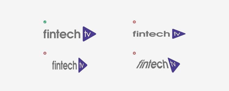
2.5 Incorrect Usage
These examples of our logo representation are incorrect. They take away from the look and feel and do not represent the brand properly. Always use the logo as it is, if you need to scale the logo, always lock the aspect ratio first.
3.0 Colour Palette
Use these guidelines to determine the best way to apply our colour palette. The primary palette contains the core colours that should be used across all communication channels. Visit the Colour Code Cheatsheet for a quick reference guide of all our brand colours.
| Purple | Grey | |
|---|---|---|
 |
 |
|
| CMYK | 85, 85, 0, 0 | 50, 40, 40, 30 |
| RGB | 76, 60, 144 | 116, 115, 115 |
| HEX | #4C4C90 | #747373 |
4.0 Typeface
Typography is a crucial element of our visual identity. Using our chosen typefaces, the correct colours and weight ensure that our typography is consistent and legible across all our communication channels.
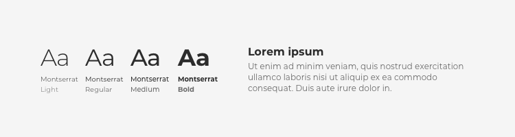
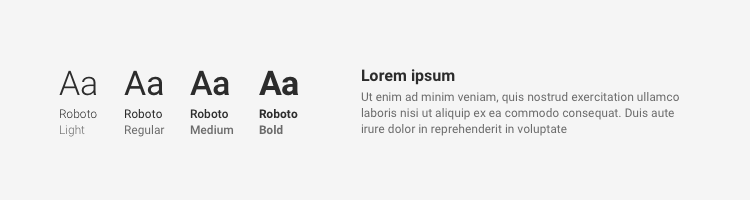
4.1 Online/Web Typeface
Our primary fonts for use online are Roboto and Montserrat. Roboto should be used for all body text and Montserrat should be used for all titles. Both are versatile fonts with many weights and styles. If you don’t have a copy of these fonts, you can download them from Google Fonts (for free).
4.2 Print/Reports Typeface
To keep branding consistent and to avoid visual disparity, Roboto and Montserrat should also be used for print and reports. The majority of our business is done online so our printed materials should reflect this.
5.0 Downloads
This logo pack contains full colour, black and whiteout versions in EPS, JPG, PNG and SVG formats. In addition to these file types, the design team hold master Adobe Illustrator files which all of the above can be exported from. If you require a different file type, or a file type at a specific size, please contact one of the designers.
For all of our downloads, visit the Download Portal.